See what art (and a lot of art direction) can do.
With a newly renovated campus and a refreshed visual identity, the Blanton needed a website that could keep up. I managed the redesign from end to end—ensuring the result looked great, worked better, and actually felt like us.
Website Redesign
Blanton Museum of Art
I led the design and content phases of the Blanton Museum’s full website redesign working with our external agency and internal teams to create a site that is welcoming, vibrant, and easy to use.
We had just finished a major brand refresh and reopened our beautifully redesigned grounds, but our website hadn’t kept up. It was outdated, hard to navigate, and didn’t reflect the full range of what we offer or who we serve. I managed the project on our end, overseeing design direction, content development, site architecture, and all the many (many!) moving parts that come with a site of this size.
I oversaw the redesign in collaboration with our fantastic external partners Juicebox, serving as the creative lead, project manager, internal point of contact, and translator between our vendor and diverse internal teams.
Project Team
Design: Juicebox Interactive
Blanton Creative & Strategy Lead: Jennifer Lioy
Blanton Director of Marketing: Carlotta Stankiewicz
Blanton Senior Digital Content Manager: Lizabel Stella
The Challenge
Our previous site didn’t live up to the experience of visiting the museum in person. It lacked warmth, clarity, and didn’t showcase our programs, exhibitions, or resources well.
The main goals:
Reflect our refreshed brand and newly renovated museum grounds
Represent both our role as Austin’s art museum and our deep connection to the university
House digital resources for educators and students
Make it easier for visitors—from first-timers to long-time members—to find what they need
Create a more intuitive, mobile-friendly experience
We’re a small team with no in-house web developer, so we had to balance this huge project on top of our regular workloads. That meant smart systems, a lot of flexibility, and a ton of cross-department coordination.
My Role
Led the internal side of the project: planning, meetings, timelines, and content workflows
Set the creative tone and worked closely with the vendor to ensure the site felt on-brand
Served as the point of contact between our team and the agency (Juicebox)
Managed feedback across departments and translated it into actionable design changes
Personally reviewed, rewrote, or helped design 50+ pages
Guided team members who were new to WordPress, offering direction on functionality, page structure, content, and media

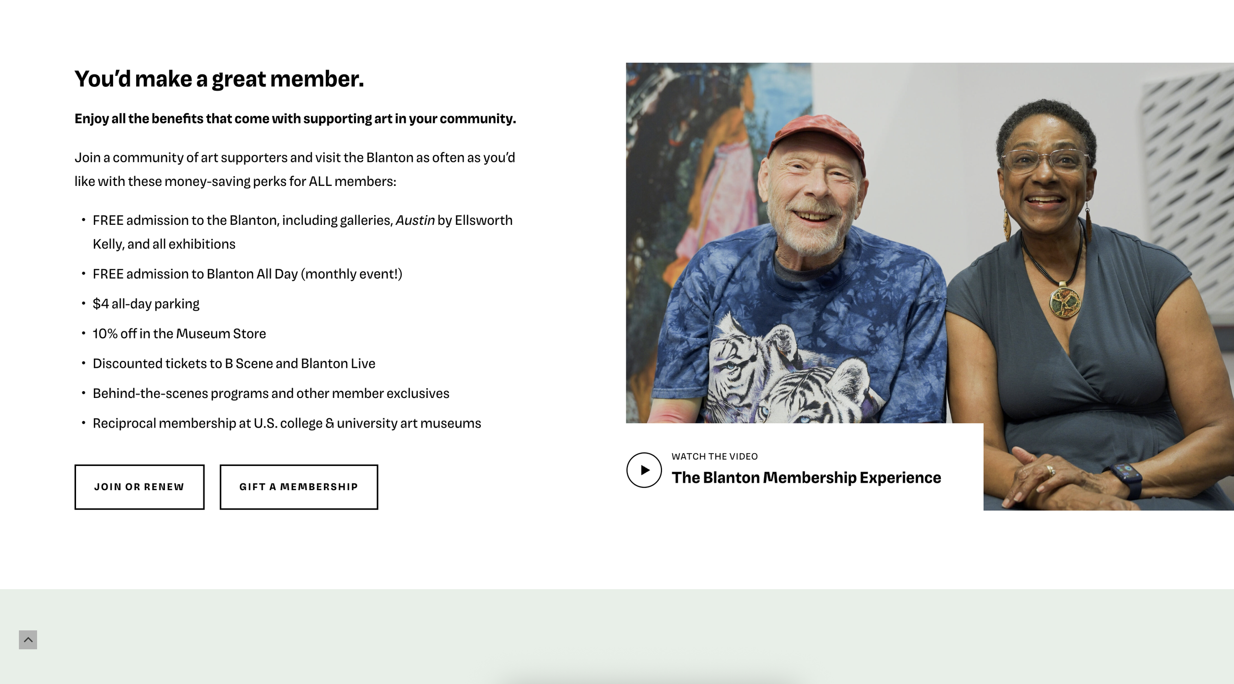
Membership page design preview
Membership page intro block

Membership level card blocks

Membership level card blocks

Membership page CTA blocks
Strategy & Collaboration
We selected Juicebox through an RFP process, and I brought my experience and institutional knowledge to help choose a partner that would meet our needs: lots of iteration, flexibility, and space to refine. During discovery, I shared how our brand had evolved and spoke to the tone we wanted to hit—world-class art with Austin warmth, friendly but not dumbed down, approachable but sharp. Think: string lights on the patio meets stunning galleries filled with art.
I reviewed everything—wireframes, design rounds, final page layouts—and provided feedback via Figma and in meetings. I also ran internal work sessions during the content phase to help teammates rewrite or restructure pages, troubleshoot designs, and keep everything moving forward.
The Outcome
The new site is a huge step forward: it looks great, loads quickly, and better reflects who we are. It’s easier to navigate, easier to manage, and gives our diverse visitors a much better first impression.
Streamlined the navigation and improved the site architecture
Brought in new visuals, video, and messaging to match our in-person experience
Created a more robust program calendar with better functionality
Made it easier to find info about membership, events, and opportunities to support our mission
Feedback from staff, leadership, and visitors has been overwhelmingly positive. Page views and event registrations are up, and the site has become a better tool for us to serve all kinds of audiences.
My Impact
I kept things moving when approvals were slow, jumped in to do hands-on page design, coached my team through the back end, and made sure the final product reflected the museum’s visual standards. I also introduced workflows and systems that made collaboration easier and that we’re still using now as we continue to refine and build out the site.
What I Learned
This project really sharpened my ability to manage feedback, communicate across disciplines, and lead a creative process that was both collaborative and high quality. I learned a lot about balancing internal priorities, making decisions without getting stuck, and guiding people through unfamiliar territory with clarity and patience. In the end, I’m proud that the site looks great, works well, and tells the story of who we are. It’s a digital home we can build on, and it reflects the care, creativity, and collaboration that went into it.